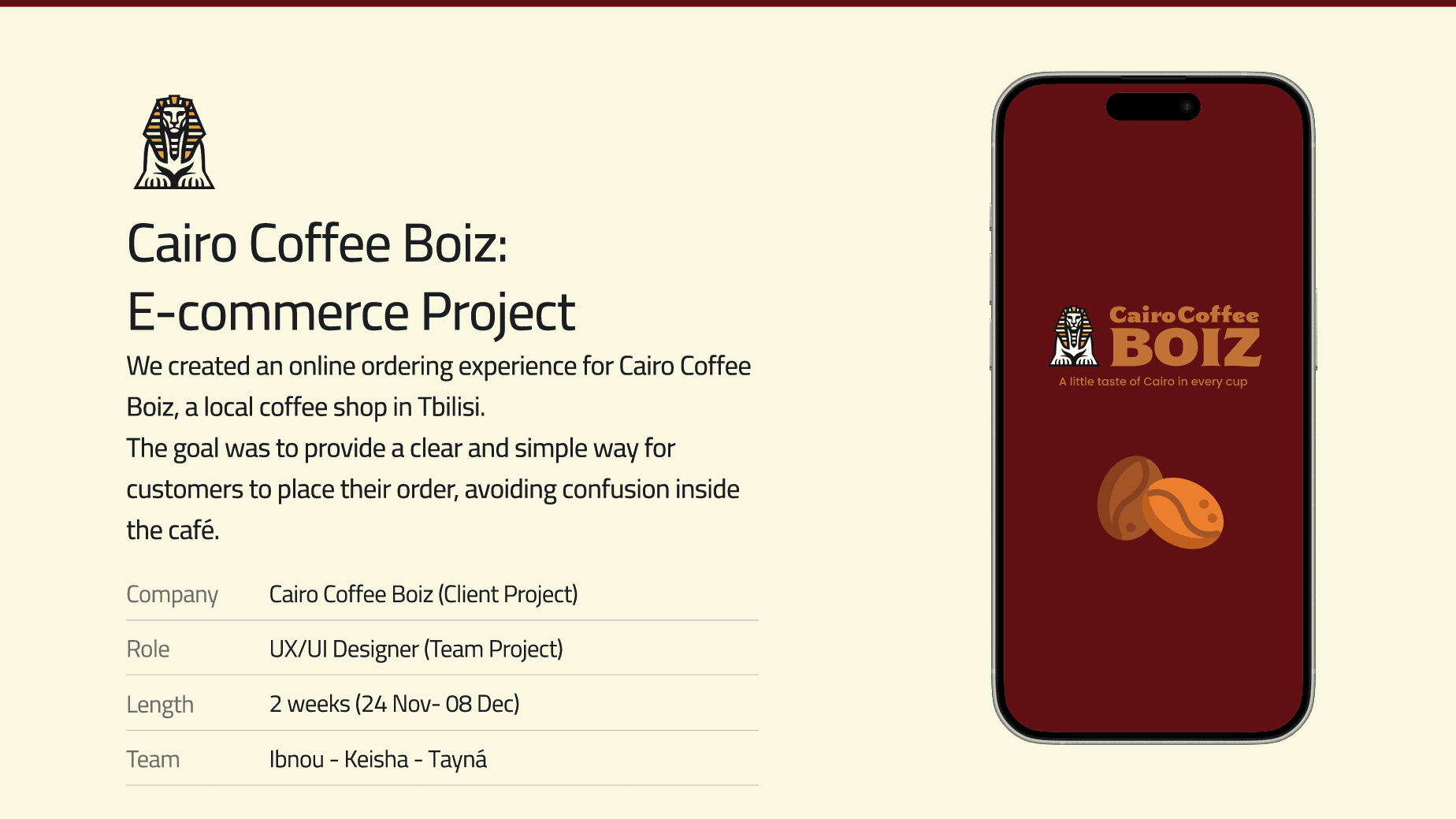
Cairo Coffee Boiz
Full UX redesign of a coffee shop's online ordering flow.
Type
Bootcamp final project
Timeframe
12 days
Toolkit
Figma & AI agents
Year
2026
Problem
I set out to improve the ordering experience for Cairo Coffee Boiz, a local coffee shop located in Tbilisi, Georgia. The café has no table service, so customers who are mainly expats and tourists often felt confused about how to order. The owner wanted a simple solution that preserved the cozy atmosphere, and customers needed clear information to order and options to customize their drinks. The challenge was to let people confidently order coffee their way without compromising the cafe’s welcoming vibe.
Solution
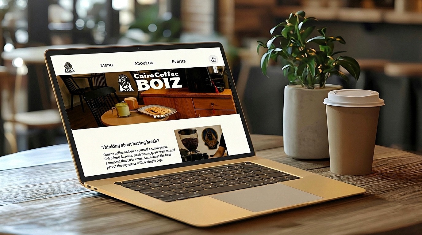
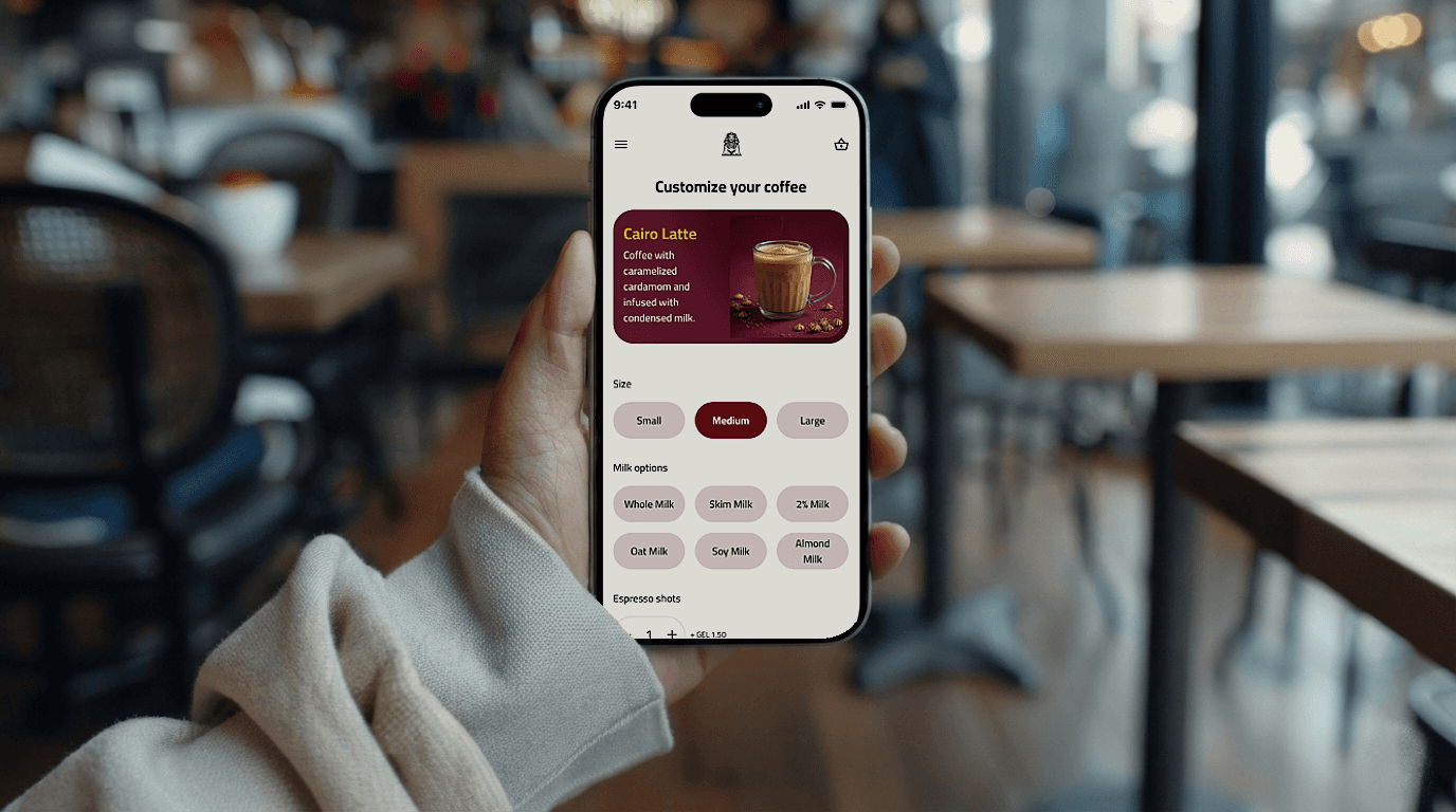
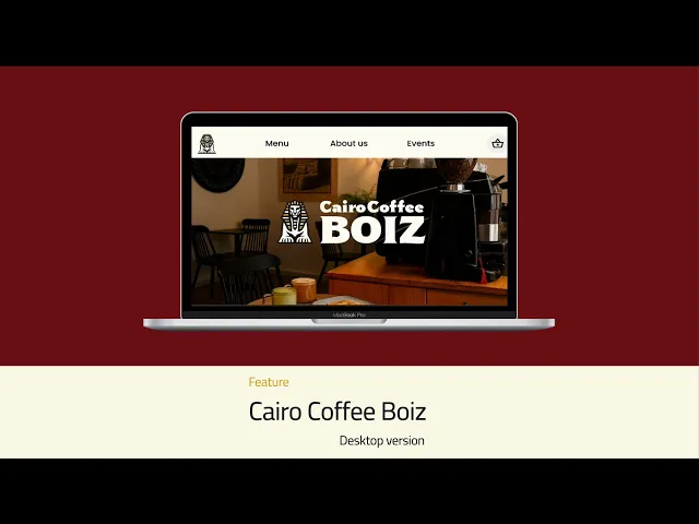
Our final design is a responsive web app for easy, pleasant ordering. When customers scan the table’s QR code, they get a friendly mobile menu reflecting the cafe’s branding with burgundy and gold accents and a cozy vibe. Each drink has a photo and description, and customers can customize their coffee (size, milk, extras). At checkout, they enter their table name and pay seamlessly (e.g. via Apple Pay). A confirmation then displays the wait time, so customers know how long until their order arrives. We also created a desktop landing page highlighting the menu, story, and reviews.
How might we make ordering and drink customization instantly clear without overwhelming first‑time visitors while preserving Cairo Coffee Boiz’s artisanal vibe?
My Role & Scope
I was product designer on a three‑person team during a product design bootcamp. I led user research, persona and journey mapping, information architecture, and the mobile‑first flow for a responsive ordering web app. I also contributed to the visual direction and design system.
Discovery
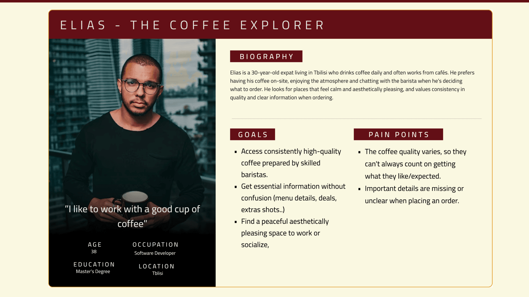
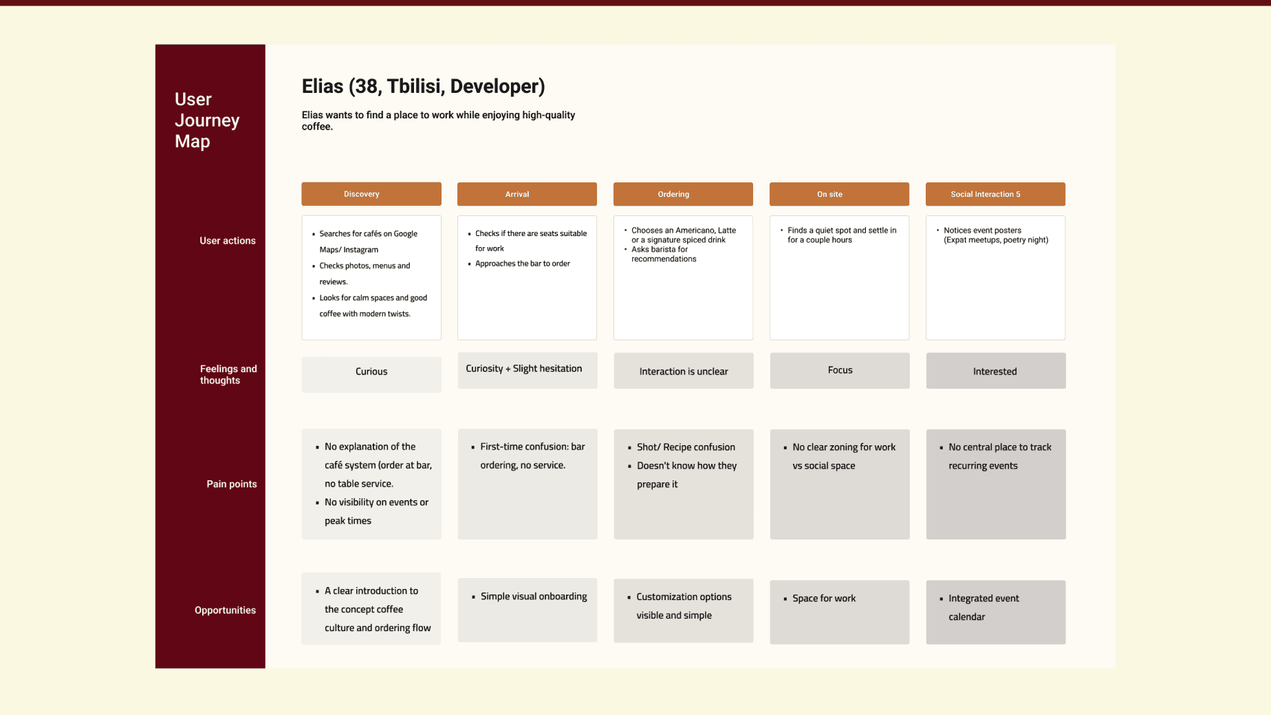
I interviewed the café owner and customers, mostly expats and tourists. They loved the warm atmosphere but felt lost when ordering. With no table service, people wondered where to stand, how to pay, and how to customize drinks. Many worried their coffee would not match expectations. I created a primary persona, Elias, a daily coffee drinker who values clarity and consistency. Mapping his journey showed the main friction at the moment of ordering: unclear process, limited guidance, and no feedback on waiting time. This led to a reframed challenge: daily coffee drinkers need a clear, predictable way to order that respects the café vibe.
Exploration
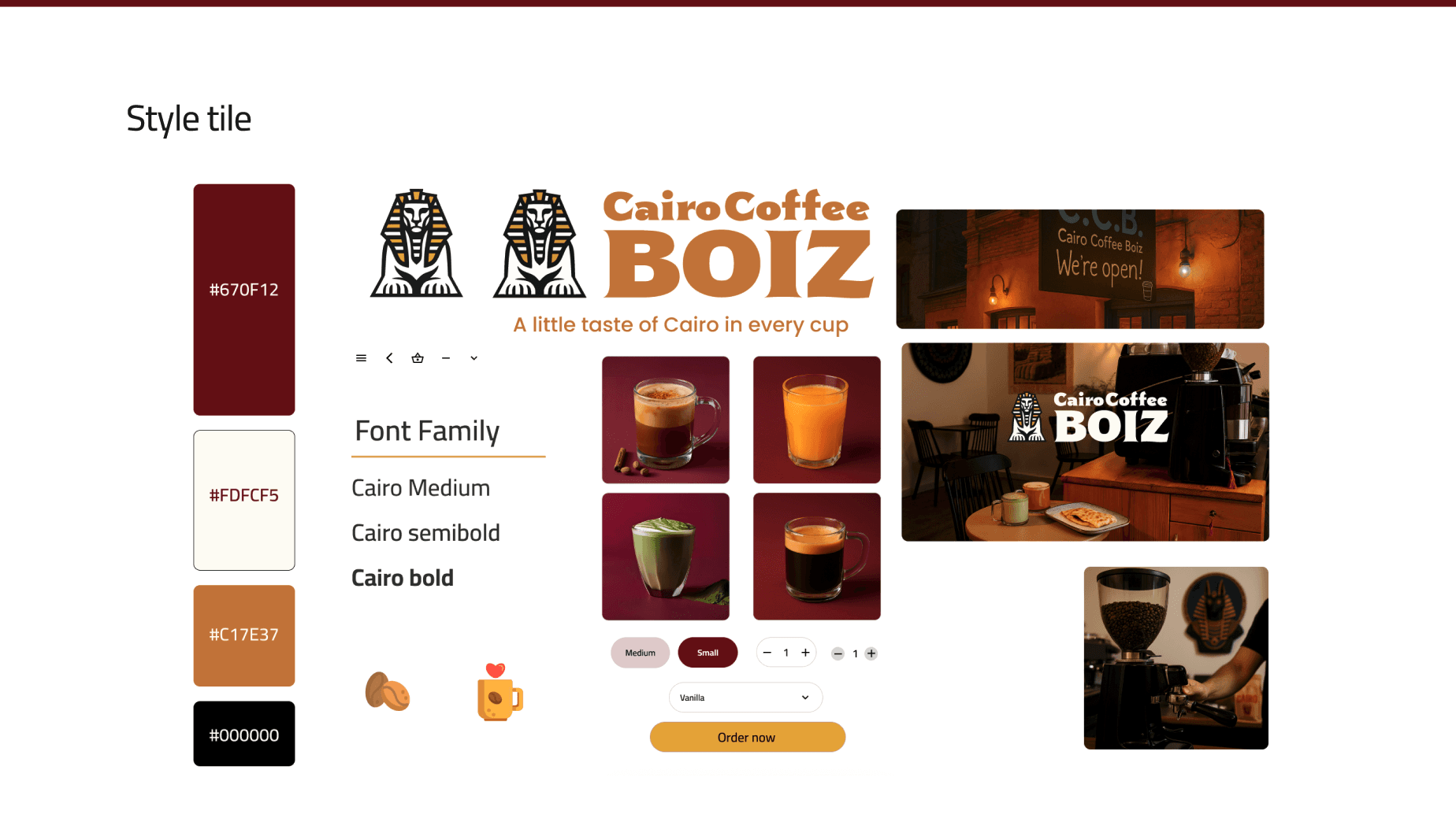
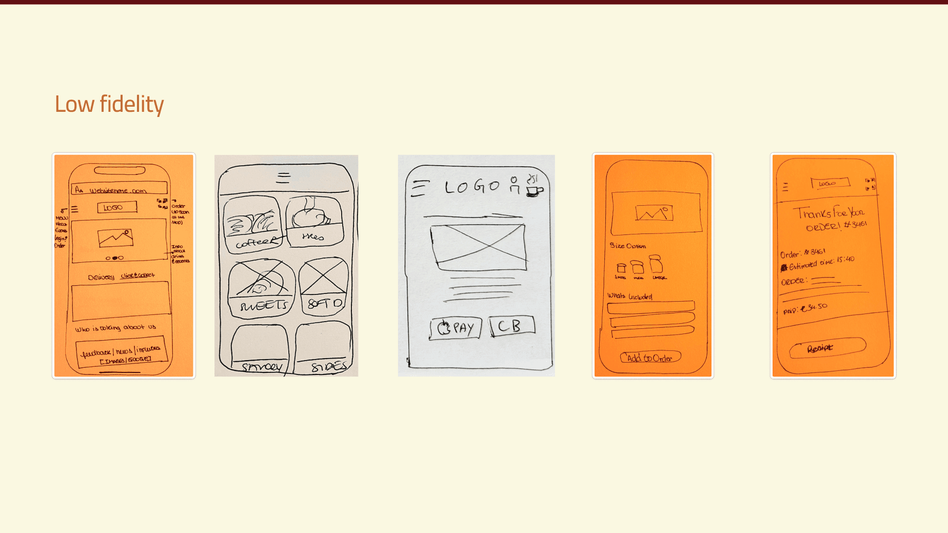
I aligned the product direction with three brand values: welcoming, artisanal, and community‑driven. I created moodboards with warm burgundy, golden yellow, and cream, and selected the Cairo typeface for readability and subtle cultural reference. Using Crazy 8s, I explored ordering concepts and then translated them into low‑fi wireframes for a table‑first mobile flow: landing → menu → customization → payment. In parallel, I ran a competitive scan of Pret à Manger, Starbucks, and others to identify clear menu patterns, imagery, and CTAs that users already understand. These insights shaped the sitemap, navigation labels, and interaction patterns.
User Feedback & Iteration
We built a mid‑fi prototype and tested it with users. Their feedback triggered three key changes: I added a QR entry screen to orient people immediately after scanning. I replaced generic icons with real drink photos and descriptions to reduce uncertainty. I surfaced an estimated prep time at checkout so users knew what to expect. After these adjustments, users navigated the flow more smoothly and expressed higher confidence when ordering.
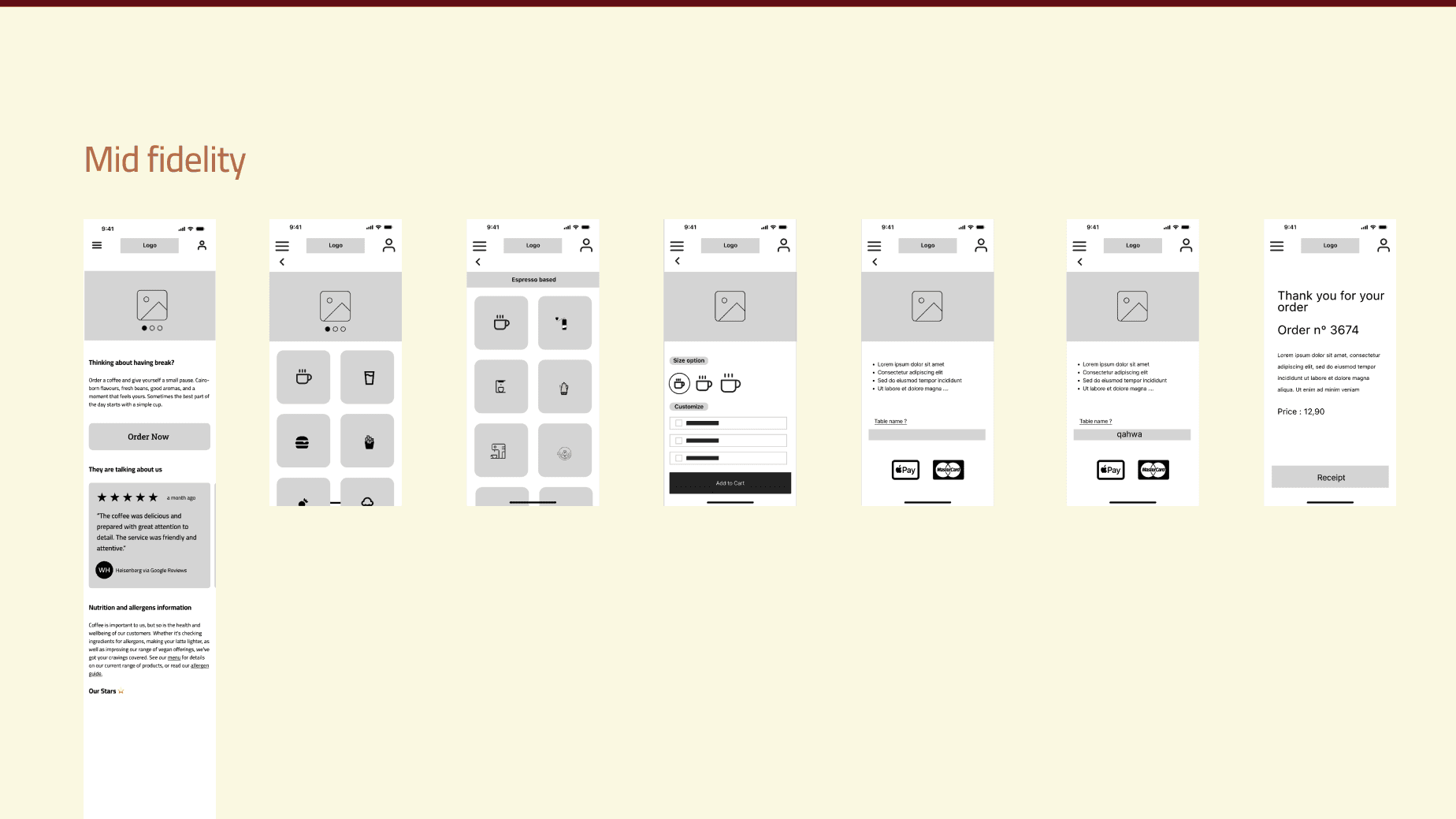
Final prototype
The final solution is a responsive web app accessed by scanning a QR code on the table. Customers land on a friendly mobile menu that reflects the café branding and warmth. Each drink shows a photo, a short description, and clear customization options (size, milk, extras). At checkout, customers enter their table name and pay seamlessly, for example with Apple Pay. A confirmation screen shows the expected wait time, closing the loop between ordering and receiving the drink. A desktop landing page supports the brand story, menu, and reviews.
Impact & Learnings
In usability tests, users felt more informed and confident when ordering with the new flow, and they responded positively to the cohesive branding and the promise of smoother service. The design should reduce miscommunication and wait times, and potentially increase repeat visits, but it has not yet been deployed on site. I learned to design for context, adapt to cultural nuances, and stay resourceful when ideal users are hard to reach.
Next
Next, the prototype would be presented to the owner and validated through on-site testing with real customers. Findings would inform refinements to copy, visual hierarchy, and the QR onboarding step. The final phase would involve preparing a clear development handoff so the café could implement the concept as a functional ordering experience.
Read the full process on Medium