
Today at Apple
Heuristic analysis of Apple Store App. Discoverability: 41% → 89%.
Type
Bootcamp final project
Timeframe
12 days
Toolkit
Figma & AI agents
Year
2026

Problem
In the Apple Apple Store app, the learning offering is labeled Today at Apple, which does not match users’ mental model of a learning platform. The label suggests a corporate event schedule rather than a place to acquire skills. Users cannot immediately determine what is available (in-store workshops, remote courses, or quick tips), who it is for, or whether participation requires payment. Competitive benchmarking against Skillshare, Duolingo, and MasterClass shows explicit learning terminology as the standard, highlighting a discoverability gap and increased time-to-understanding.
Solution
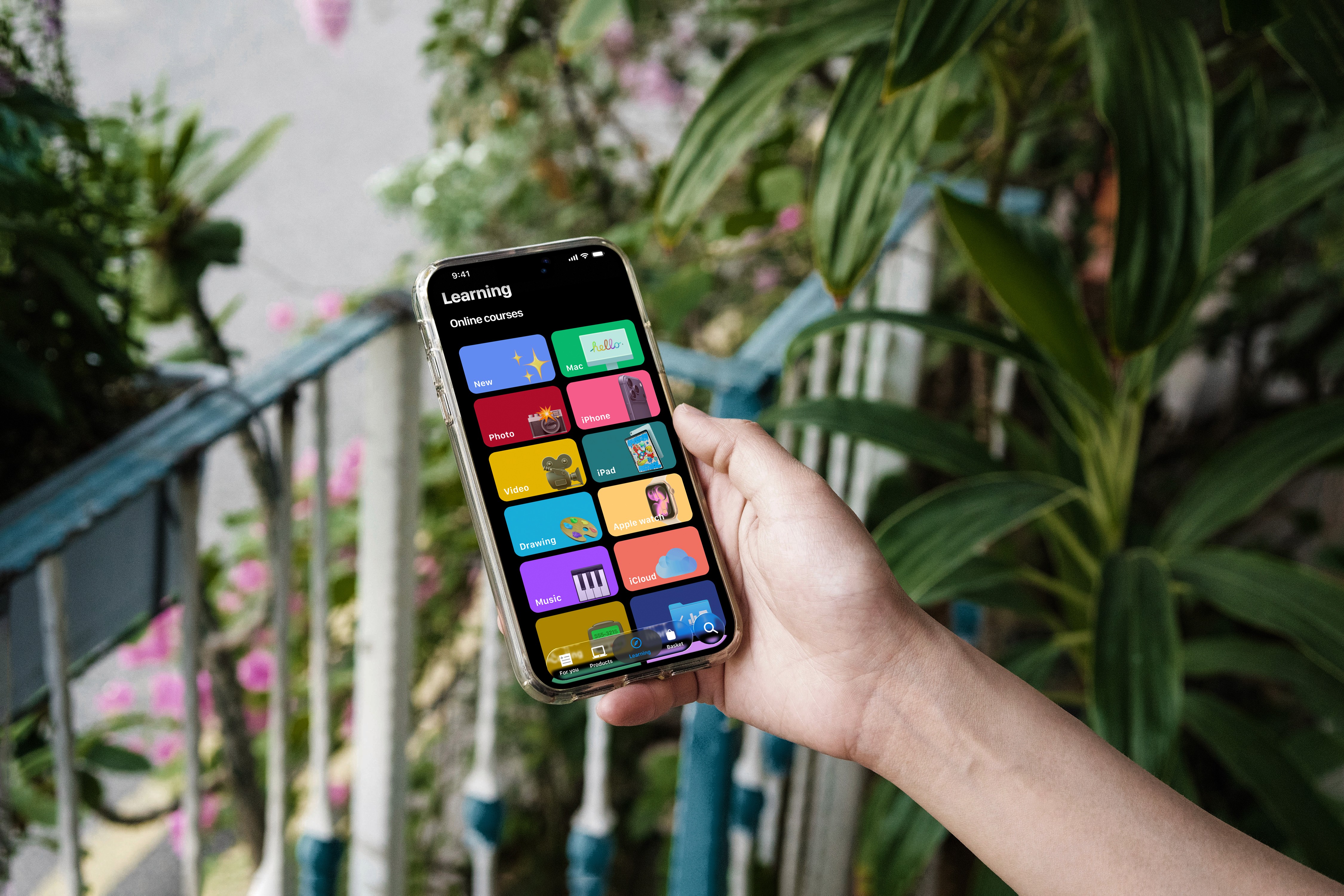
Rename and restructure the section around a clear “Learning” mental model, organizing content into three explicit paths: In-Store Courses, Remote Courses, and Tips. Each path uses familiar content patterns and progressive disclosure (overview → category → session detail → start learning). This surgical change aligns system language with user expectations, reduces cognitive load, and makes the learning offer immediately understandable and discoverable without redesigning the broader experience.
How might we make Apple Store’s learning content instantly discoverable and intuitively organized, using familiar Apple patterns, without confusing users between in‑store, remote, and tips sections ?
My Role & Scope
I worked as a solo product designer during a 2‑week Ironhack exercise. I led the heuristic analysis, competitive benchmarking, information architecture, and a focused UI concept for the learning section. This was a conceptual project; there was no Apple stakeholder or engineering team.
Discovery
I started with Nielsen’s heuristics and quickly saw a breach of “match between system and real world”. “Today at Apple” felt like a corporate event calendar, not a learning hub. Users scanning the tab could not answer three basic questions: What can I learn? Is this for me? Is it free? Competitive analysis confirmed the gap: Skillshare uses “Courses”, Duolingo “Learn”, MasterClass “Classes”. Apple was the outlier. This showed a mismatch between the label and what users expect from learning products.
Exploration
I framed a hypothesis: if I rename and restructure the section around a clear learning mental model, time‑to‑understanding should drop from 8 seconds to 2 seconds. I mapped the current content into three buckets: in‑store workshops, remote sessions, and quick tips. From there, I designed a simple IA: “Learning” as the main entry, then three clear paths. I used Apple Music and TV as structural references to stay inside familiar Apple patterns instead of inventing a new one.
User Feedback & Iteration
I did not test this concept with real users or Apple teams. Iteration came from refining the flows and screens against the heuristics and mental model mapping. I also reworked my Figma file from 37 separate artboards to a component‑based system with variants. This made it easier to adjust labels and hierarchy without redrawing everything.
Final Prototype
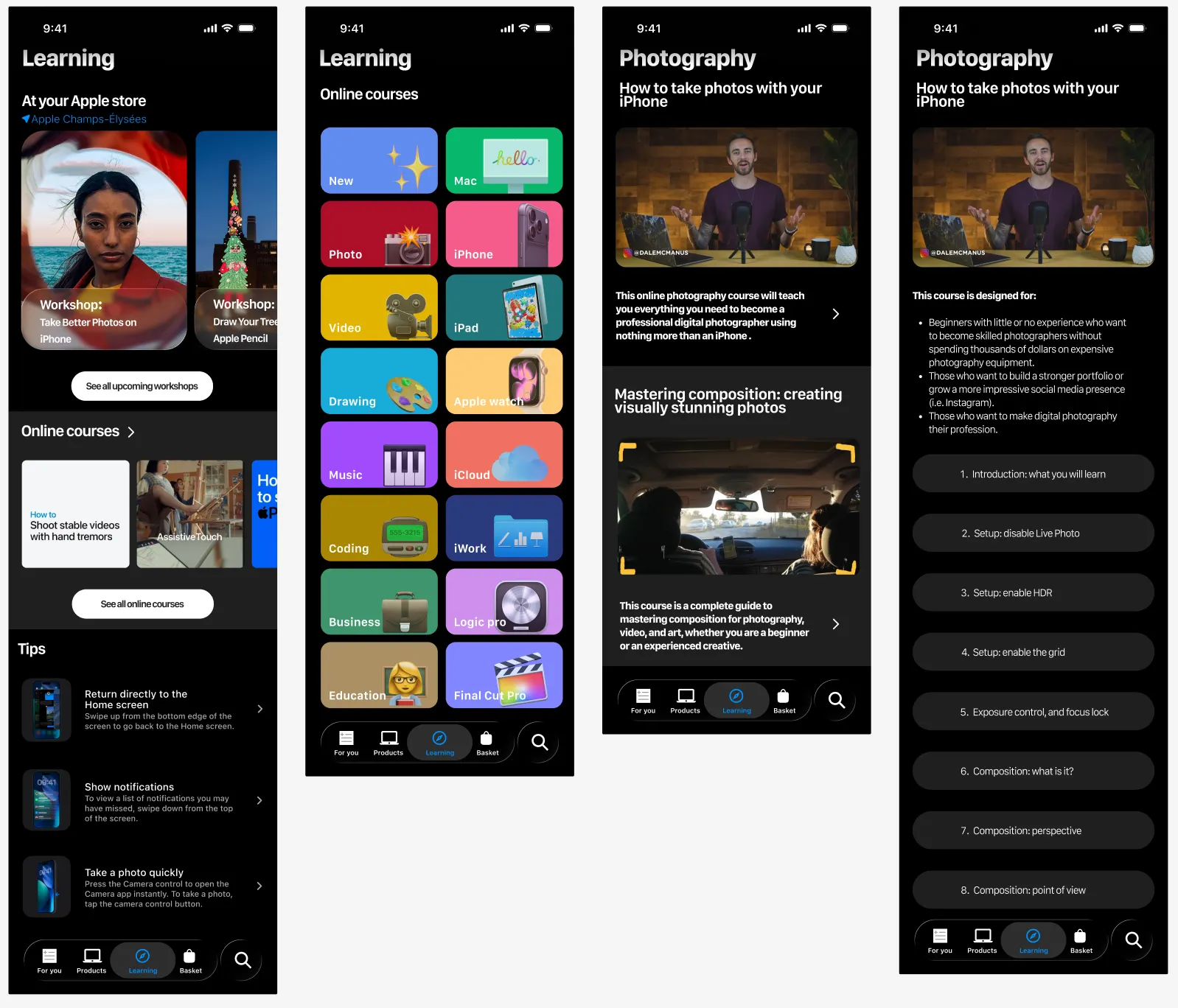
The final concept replaces “Today at Apple” with a “Learning” tab that opens three clear paths:
1. In‑store courses: hands‑on sessions with a map and schedule.
2. Remote courses: themed series like Photography, Music, Code.
3. Tips: 60‑second skill videos from Apple experts.
For a photography course, the detail page uses progressive disclosure: a 30‑second intro, chapter list, then “Start Learning”. No paywalls or distractions.
(Image: Learning home and photography course flow)
Impact & Learnings
This work showed how small, surgical changes can unlock more value than a big redesign. Aligning the label and structure with user mental models likely reduces cognitive load and time‑to‑understanding, but this is not yet validated with data. Personally, I learned I over‑invested in UI polish: around 45% of my time went into details instead of flows. Rebuilding the file with components and an atomic mindset taught me to prioritize structure over pixels.
Next
Next, I would run quick tests: A/B “Today at Apple” vs “Learning”, and measure time‑to‑understanding and tap‑through to courses. I would also validate the three‑path IA with learners and store staff, then refine labels, hierarchy, and motion based on results. Finally, I would extend the component library to support other content types while keeping the learning experience consistent.
Read the full process on Medium

